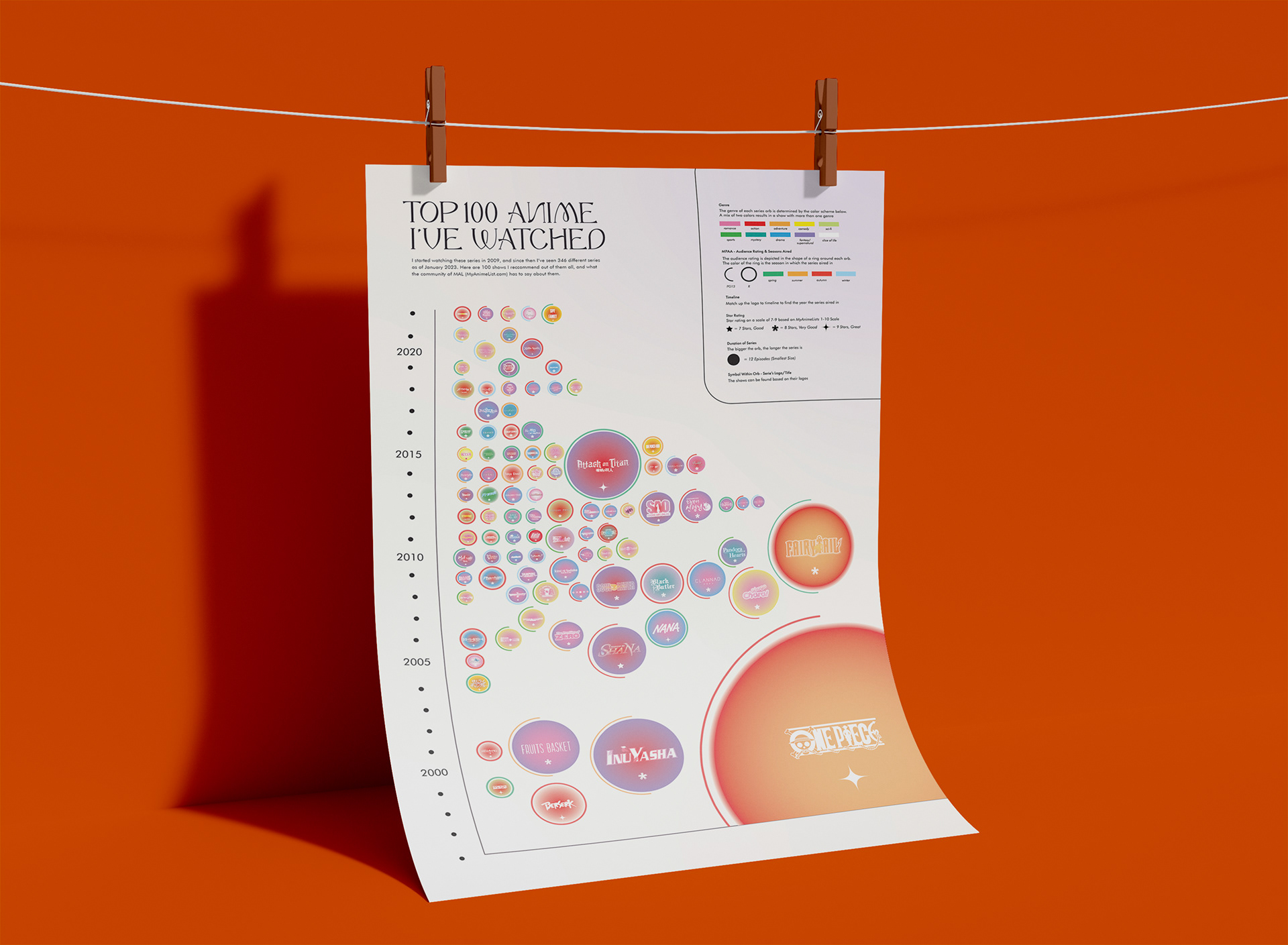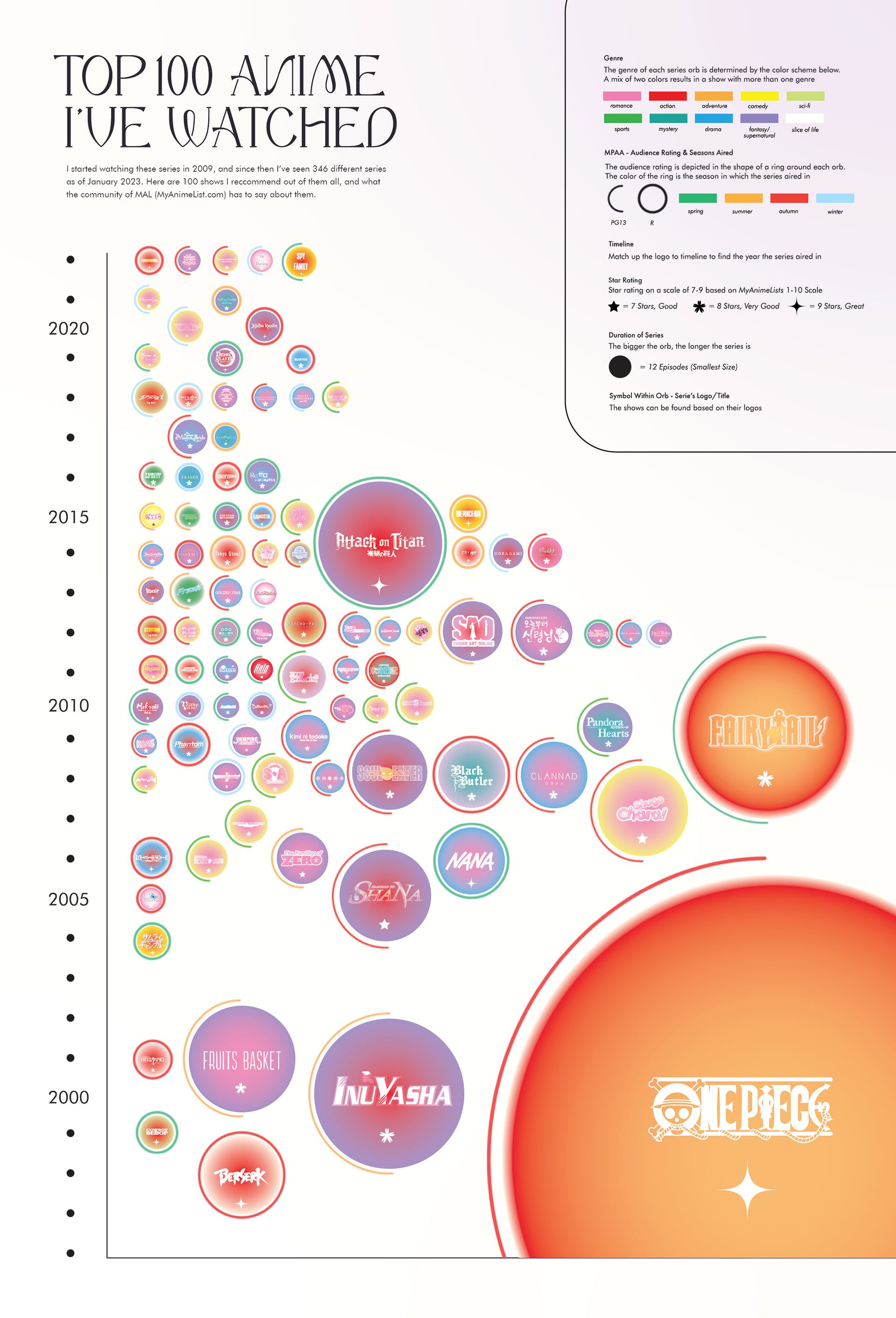
This infographic is a freeform plot styled graph that represents 100 of the 300+ anime series I've seen. This accumulation of data was collected between 2009 - 2022. The series can be found within each colorful orb based on their type logos. The colors of the orbs represents the genres, the size represents the duration, and the rings around them represent the audience rating (E-M). In addition, the shape of the little stars found in each orb symbolize the audience rating based on a scale of 1-10 (however, each show depicted ranges between 7-9, hence the three shapes). The year in which the show aired in can be determined by horizontally matching up the logo with the timeline. Otherwise, the series aren't displayed in any order of favoritism.